
 Tiếng Việt

Bar charts are price charts that display open, high, low, and close (OHLC) in a single bar, allowing traders to capture full price action within a specific time frame.
However, the structure of bar charts consists of four key components: open, high, low, and close, which clearly represent price range and volatility in the market.
Additionally, reading bar charts helps traders identify bullish and bearish signals based on price positioning, making it easier to analyze trends and market sentiment.
Meanwhile, bar charts differ from candlestick charts by focusing on price structure rather than color visualization, offering a more data-driven approach to analysis.
Therefore, bar charts are widely used in trading strategies such as trend analysis, breakout setups, and price action trading, making them highly applicable in real market conditions.
Choosing the right chart type directly impacts how traders interpret price movements and make decisions. Among them, bar charts remain a powerful yet often overlooked tool for understanding market structure.
Bar charts in financial markets and their definition
Bar charts are foundational technical analysis tools that display an asset’s price movement over a specific time interval using a series of vertical lines with horizontal ticks.
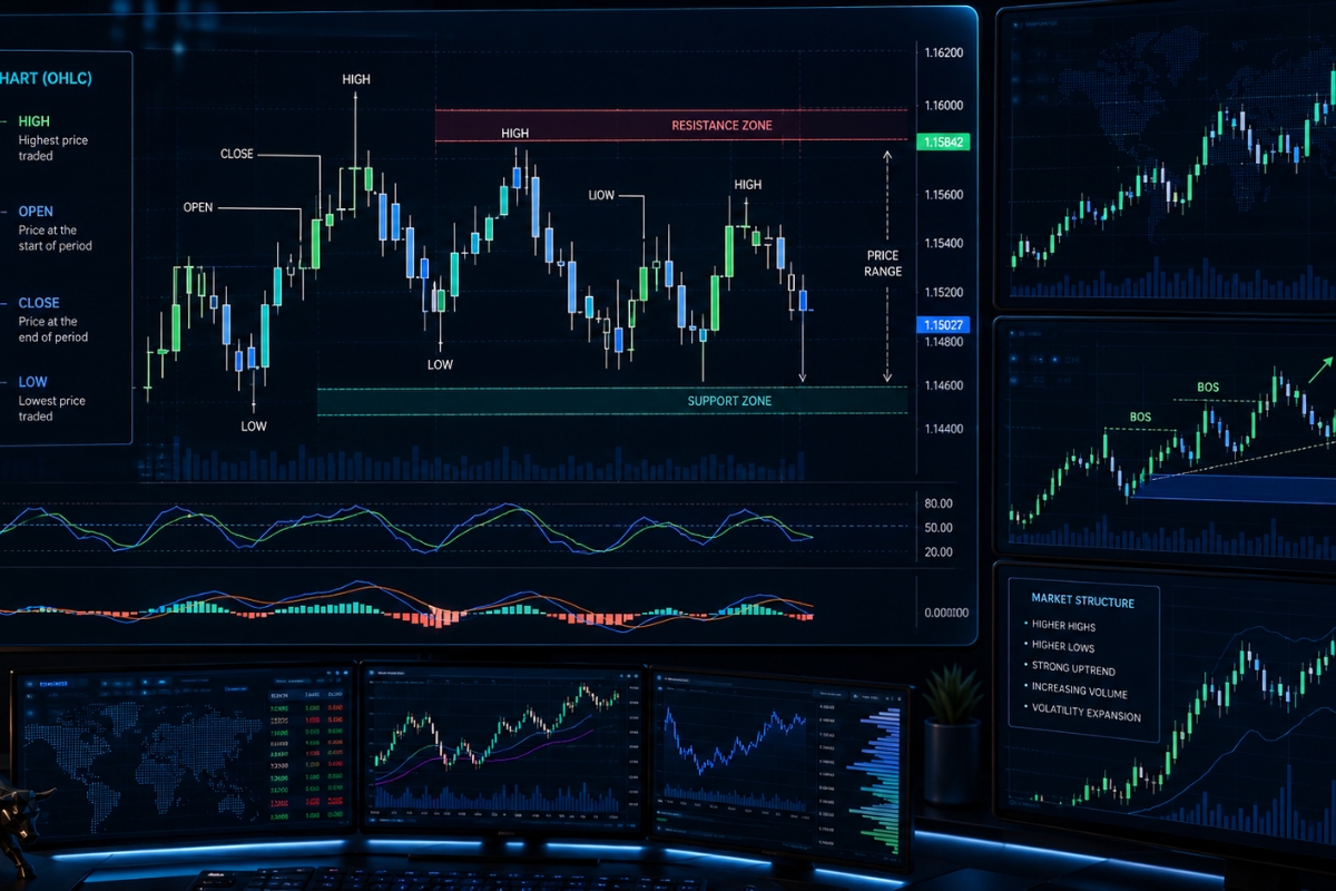
Statistically, a single bar maps out four critical price points—the Open, High, Low, and Close—for intervals ranging from a 1-minute scalp to a 1-month macro trend line. Unlike basic linear plots, this format provides market participants with a complete view of supply and demand distributions, allowing investors to quickly measure market volatility and locate historical support or resistance zones.
What is a trading bar chart?
A trading bar chart is a visual timeline of price action where each individual vertical bar represents the entire price range of an asset during a designated block of time. Often referred to as an OHLC chart (Open, High, Low, Close), it details the exact path of market negotiations between buyers and sellers within that time segment. The vertical length of the bar represents the maximum price expansion, while the horizontal extensions on either side mark the opening and closing transaction points, forming the backbone of classical price action charting.
Recognizing the technical depth of this layout explains why professional market operators look past simplified line graphs when building strategic models.
Why do traders use bar charts instead of line charts?
Professional traders prioritize bar charts over line charts because line charts plot only closing prices, thereby hiding 75% of critical intraday data points. Line charts fail to show the maximum high or minimum low of a trading session, masking the true extent of market volatility and institutional liquidity sweeps. By providing the full price-action range, bar charts reveal the exact points where buyers or sellers capitulated, allowing professional chartists to identify the structural exhaustion that precedes major market reversals.
Once you appreciate the informational superiority of this layout, you can begin analyzing the individual price components that make up a single bar.
Structure of bar charts and price components
The structure of bar charts relies entirely on a standardized four-point pricing framework that maps out the lifecycle of a single trading session with mathematical precision.
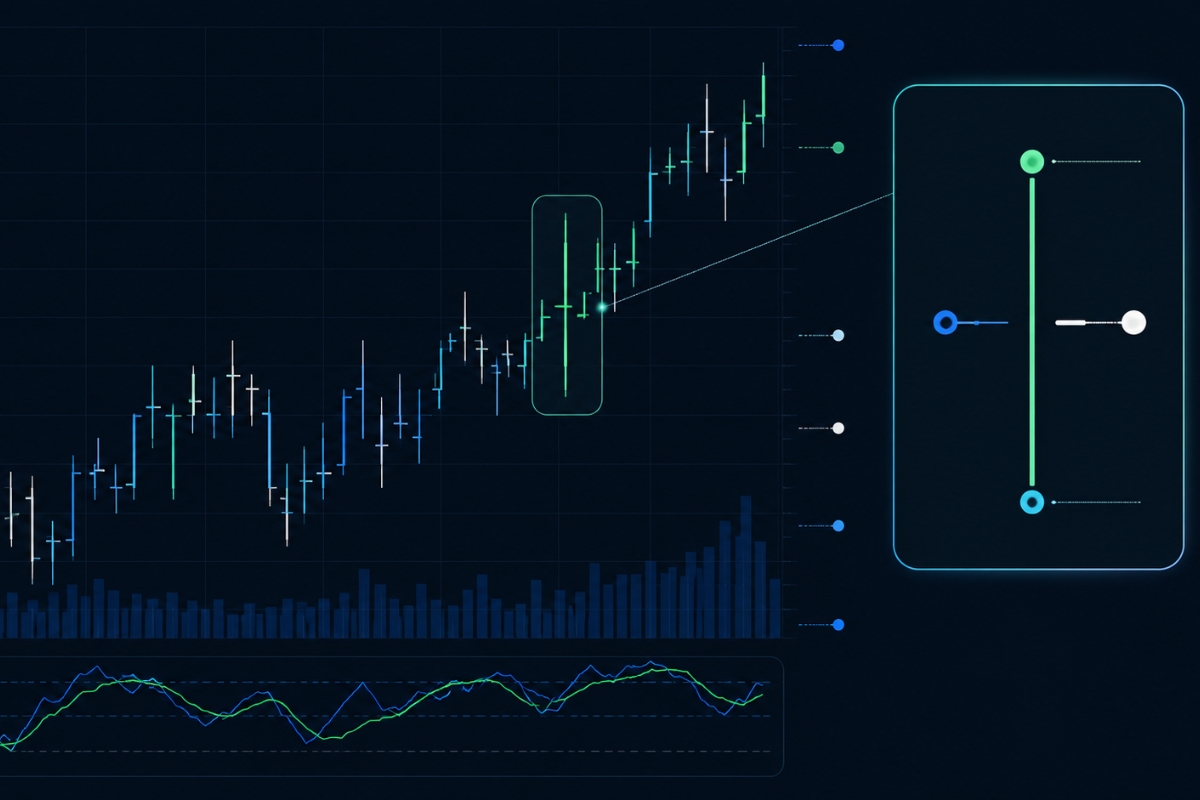
Every vertical bar contains a core backbone and two distinct horizontal markers that quantify the opening sentiment, the maximum bullish push, the maximum bearish counter-attack, and the final closing valuation settlement. By analyzing the structural distance between these individual components, a technical analyst can immediately measure whether bulls or bears won the tactical tug-of-war for that specific session.
What does each component of a bar represent?
Every individual bar on a financial chart is built using four structural price components:
- The Vertical Spine: The absolute top of the vertical line represents the High (maximum price paid), while the absolute bottom represents the Low (minimum price accepted) during the session.
- The Left Horizontal Tick: A small horizontal node extending to the left represents the Open price, marking the exact starting value when the session candle began.
- The Right Horizontal Tick: A small horizontal node extending to the right represents the Close price, marking the final transaction settled before the session expired.
Understanding this technical structure is critical to ensure you do not confuse a professional financial tool with generic business visualization formats.
How do bar charts differ from visual formats like 3D bar charts?
A professional financial bar chart is entirely different from a 3D bar chart or a standard corporate column graph, as they serve completely unrelated industries. A 3D bar chart is a static data presentation graphic used in business reporting to compare static quantities (such as annual sales or demographic percentages) along an X and Y axis. A financial OHLC bar chart, however, is a dynamic, multi-dimensional price action engine that tracks continuous, time-series market liquidity, order execution ranges, and real-time capital distributions across global exchanges.
With structural mechanics firmly understood, the next milestone is learning how to read these bars collectively to identify live market trends.
How to read bar charts in trading effectively?
Reading bar charts effectively requires a trader to look beyond an isolated vertical line and instead analyze the sequential relationships between multiple consecutive bars.

By tracking whether the opening and closing ticks are rising or falling across a series of sessions, you can objectively determine who controls the market’s immediate velocity. This analysis allows an operator to filter out short-term market noise and identify high-probability entry windows based on pure price action architecture.
How to identify bullish and bearish bar signals?
Isolating immediate directional control on an OHLC chart requires a quick examination of the vertical position of the right horizontal tick relative to the left horizontal tick.
- Bullish Bar Signal: A bar is classified as bullish when the right closing tick is situated higher than the left opening tick, indicating that buying pressure drove the session upward.
- Bearish Bar Signal: A bar is classified as bearish when the right closing tick settles lower than the left opening tick, proving that sellers successfully controlled the session.
- Institutional Rejection: A bar with a long vertical tail below a high closing tick indicates a strong defense of support by institutional buyers.
As these individual bullish and bearish bars print sequentially, they form larger macroeconomic structures that map out the broader market trend.
How to analyze trends using bar charts?
Trend analysis using bar charts is executed by tracking the continuous progression of the vertical peaks (Highs) and troughs (Lows) over time. A valid Uptrend is confirmed when a series of bars consistently prints higher highs and higher lows, with the closing ticks regularly settling near the upper third of each bar’s total range. Conversely, a Downtrend is identified by a sequence of lower highs and lower lows, indicating that sellers are aggressively dumping inventory at deeper discounts, which helps you align your positions with dominant market flows.
While bar charts provide an exceptional view of price action, comparing them to candlestick charts helps highlight their unique visual advantages.
Comparison between bar charts and candlestick charts
The comparison between bar charts and candlestick charts centers around how price data is visually presented, as both formats utilize the exact same underlying OHLC data points.

While Japanese candlesticks dominate retail trading platforms due to their heavy, color-filled bodies, classical Western bar charts remain highly valued by seasoned professionals because of their clean, minimalist aesthetic. Understanding the distinct differences between these two charting methodologies allows an analyst to select the optimal layout for their specific strategy.
What is the difference between bar charts and candlestick charts?
The primary difference between a bar chart and a candlestick chart is the presence of a real body that colors the space between the Open and Close prices.
- Candlestick Charts: Utilize a thick, colored block (usually green or red) to fill the area between the open and close, making immediate visual recognition easier but sometimes cluttering the chart during high-density trends.
- Bar Charts: Rely entirely on minimalist horizontal ticks to display the open and close, keeping the chart exceptionally clean and allowing advanced chartists to see structural trendlines and multi-bar patterns without visual obstruction.
This structural variation raises a common question regarding which format a newcomer should adopt when first entering live financial markets.
Which chart type is better for beginners?
Candlestick charts are often easier for beginners because color-coded bodies provide immediate feedback on whether a session closed positive or negative. However, as a trader transitions toward advanced price action methodologies, shifting to a clean bar chart can help reduce visual fatigue and prevent overreactions to sudden market fluctuations. For clients managing their asset analysis through XM Guide, utilizing the customizable charting suites on the platform allows you to toggle seamlessly between both formats to ensure optimal clarity.
With both structure and visual style defined, let’s explore the practical trading strategies used to execute positions in real-time markets.
Using bar charts in trading strategies and real markets
Using bar charts in trading strategies requires a rule-based execution system that converts price geometry into objective buy and sell signals.

Professional traders do not trade on intuition; they wait for specific bar configurations to form at major historical liquidity pools before committing their capital. By matching high-probability bar chart patterns with disciplined position-sizing, market operators can build a consistent, scalable trading model across all global asset classes.
How do traders apply bar charts in real trading?
To apply bar charts systematically in live markets, professional technical analysts follow a strict 5-step operational protocol:
- Step 1: Identify bar chart structure: Scan your higher timeframe charts (such as the 4-Hour or Daily) to determine the baseline market trend by tracking the sequence of bar highs and lows.
- Step 2: Locate key support or resistance: Draw horizontal rays across major historical inflection points where multiple bars have previously rejected, establishing your primary execution zones.
- Step 3: Wait for a pattern trigger: Monitor your defined zone closely and wait for a specific structural bar configuration (such as an Inside Bar or an Outside Reversal Bar) to print completely.
- Step 4: Set stop loss outside the structure: For a long position, place your defensive Stop Loss safely below the absolute lowest point of the setup bar to protect your account equity against false breakouts.
- Step 5: Set take profit based on volatility: Measure the average vertical height of the last 14 bars (ATR) and project a minimum 1:2 Risk-to-Reward (R:R) target upward from your entry point to secure your profit.
While this five-step layout provides an exceptional execution path, you must familiarize yourself with the specific bar patterns that trigger a trade.
What are common bar chart trading setups?
Two of the most powerful and historically reliable trading setups unique to bar chart structures include:
- The Inside Bar Setup: This occurs when a new bar forms completely within the vertical high-to-low range of the preceding bar, signaling a temporary contraction in volatility. Traders execute a breakout order when a subsequent bar breaches the mother bar’s extreme points, catching a massive surge in momentum.
- The Outside Reversal Bar: This setup occurs when a bar completely engulfs the entire vertical range of the previous bar and closes in the opposite direction of the primary trend. When aligned with the advanced educational indicators found on the MBroker, this setup serves as a highly accurate signal of institutional trend reversals.
In summary, Bar Charts remain an irreplaceable tool for serious technical analysts due to their clean, minimalist geometry and complete presentation of OHLC price data. By mastering individual bar anatomy, identifying key structural support zones, and enforcing strict risk parameters on your execution setups, you can safely transform raw price movements into a highly structured trading business.

Thoren Vextal is a specialist in XM trading guides, offering practical insights and real-market experience to help traders improve their strategies and trading performance. Email: [email protected]