
 Tiếng Việt
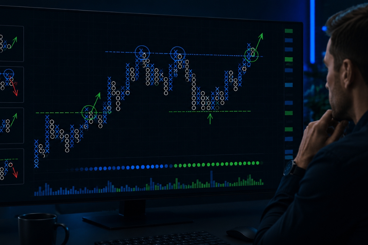
Point and Figure Charting is a price-action method that helps identify clear trends and key support/resistance levels by filtering out market noise
Moreover, point and figure charting improves trend clarity by filtering out minor price fluctuations, allowing traders to see clear uptrends and downtrends without market noise.
Additionally, common patterns in point and figure charts include double top breakouts and double bottom breakdowns, which are widely used to identify strong entry and exit signals.
Furthermore, trading methods using point and figure charting focus on breakout and trend-following strategies, helping traders capture major price movements across different markets.
However, point and figure charting has limitations such as lack of time context and fewer signals in sideways markets, so it should be combined with other tools for better decision-making.
If you’re new to trading or exploring XM, having a clear roadmap is essential. This XM Guide will walk you through everything from account setup to trading basics, helping you get started quickly and avoiding common beginner mistakes.
Point and figure charting and its role in technical analysis
Point and figure charting is a classical technical analysis methodology that records pure price movement by using columns of Xs to represent rising prices and Os to represent falling prices, completely independent of time or volume intervals.
Statistically, this technique dates back to the late 19th century and remains highly valued by institutional desks because it eliminates minor intraday price fluctuations, known as noise, from the data stream. By utilizing a fixed box size (e.g., 10 pips or $1) and a strict reversal threshold (typically a 3-box reversal rule), this system ensures that only significant supply and demand shifts modify the structure of the chart.
What is point and figure charting in trading?
In live trading, a Point and Figure (P&F) chart is a non-time-dependent technical asset that visualizes the ongoing struggle between buyers and sellers. The grid updates only when the price moves by a predefined absolute amount, meaning the chart can remain completely unchanged for days during low-liquidity consolidation, or plot multiple columns during hyper-volatile trading sessions. A column of Xs indicates that demand is dominant and driving the asset higher, whereas a column of Os confirms that supply has seized control and is forcing a structural markdown.
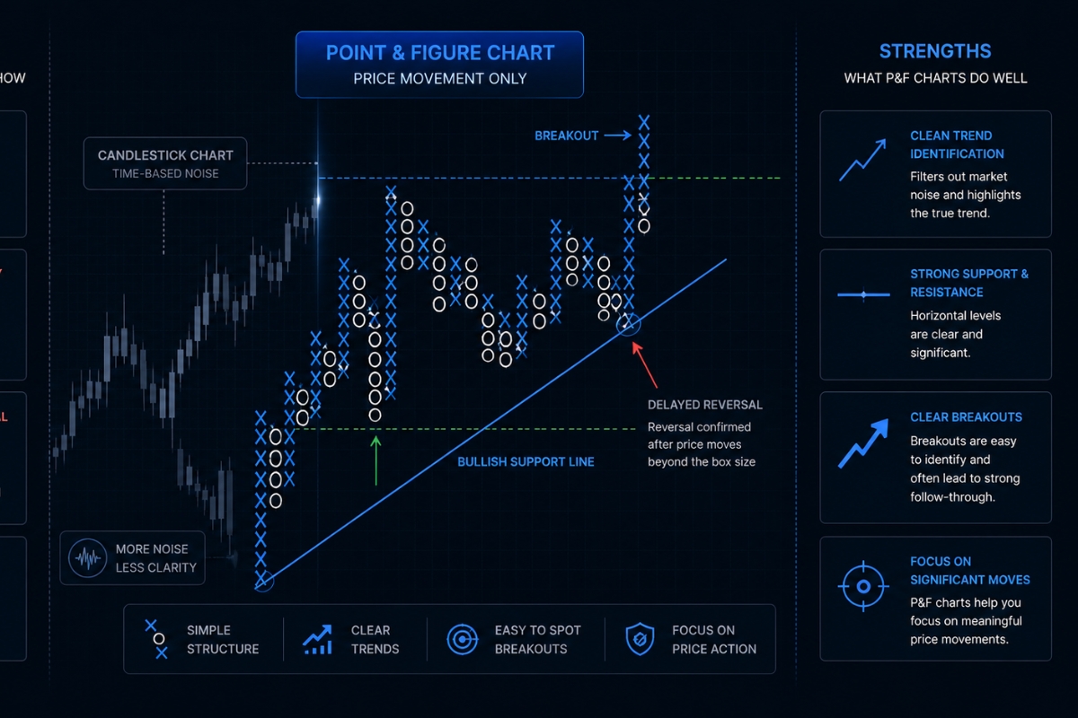
Understanding this structural recording mechanism allows you to clearly evaluate how it contrasts with standard time-aggregated candlestick profiles.
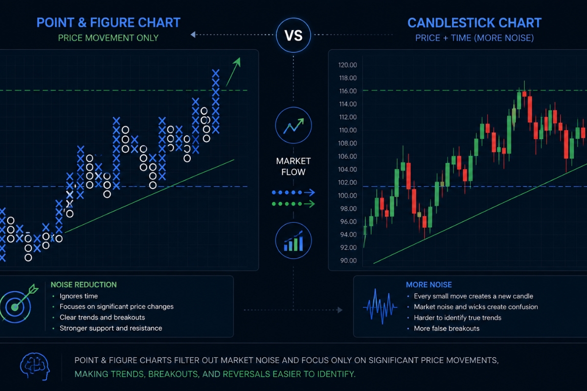
How is point and figure different from candlestick charts?
The operational differences between P&F systems and standard Japanese candlestick charts can be summarized across three critical design parameters:
- The Time Variable: Candlestick charts print a new bar after a fixed period (e.g., 5 minutes or 1 day), regardless of market activity. P&F charts completely ignore time, moving to a new column only when a trend reversal occurs.
- Volume Integration: While candlesticks require separate volume histograms, a P&F column naturally expands based on the intensity of price velocity alone.
- Noise Reduction: Candlesticks display every minor high and low wick, which often triggers emotional overtrading. P&F charts filter out these micro-fluctuations, revealing only the core directional shifts.
By removing the distorting element of time, this box-based methodology gives analysts an unparalleled view of the underlying macroeconomic trend.
How point and figure charting improves trend clarity?
Point and figure charting improves trend clarity by utilizing a rigid structural system that automatically plots objective 45-degree trendlines based on the asset’s price extremes.
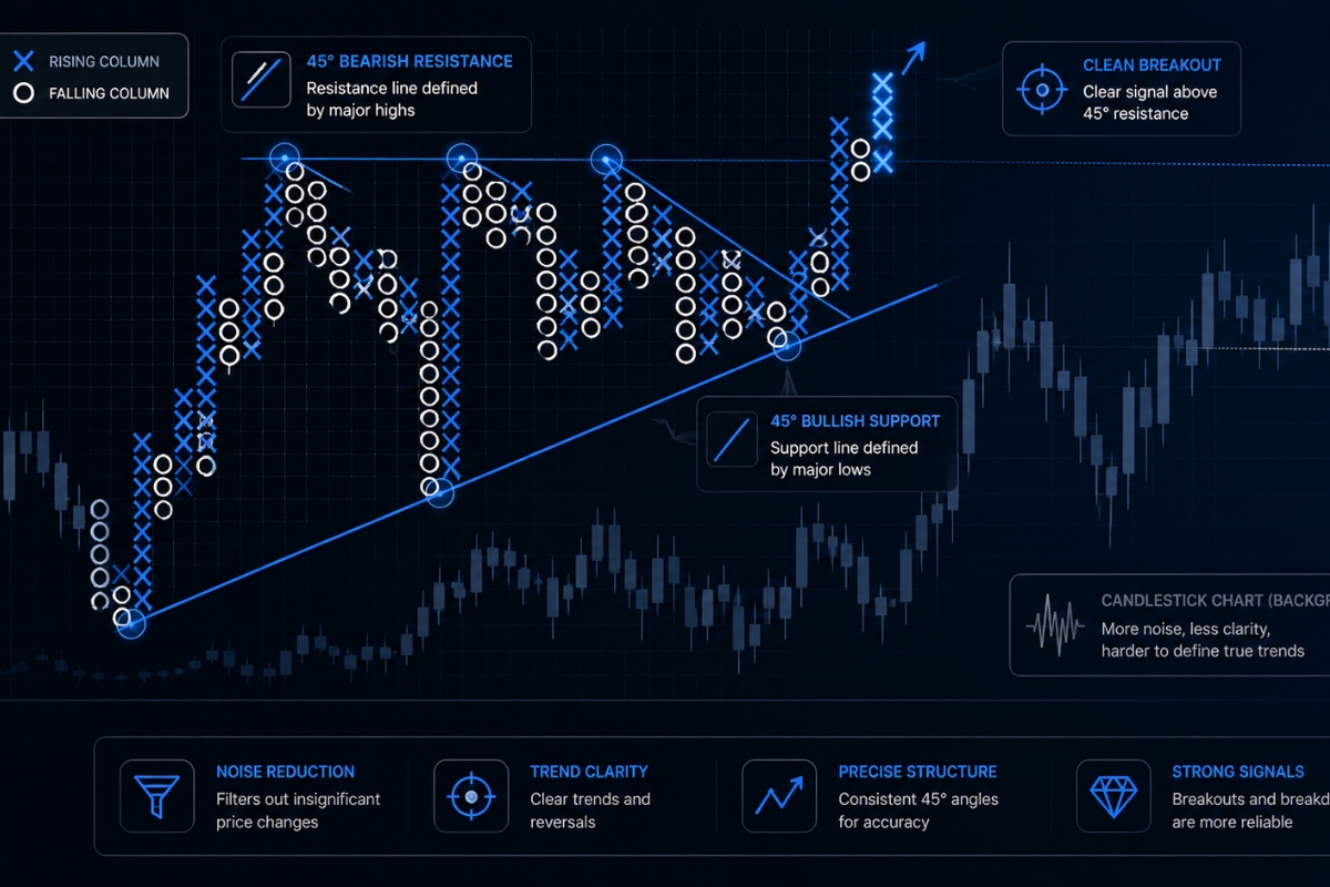
Unlike traditional charts where drawing trendlines involves subjective guesswork across erratic wicks, P&F trendlines are strictly mathematical, originating from a verified major peak or trough at a precise 45-degree angle. This structural consistency ensures that a bullish support line or a bearish resistance line means exactly the same thing across every asset class on your radar.
Why does point and figure charting show clearer trends?
P&F charting provides unmatched trend clarity because its underlying reversal filter prevents the chart from updating until an opposing force proves it can shift the market by a multi-box margin. For instance, under a standard 3-box reversal rule, a bullish column of Xs will not yield to a bearish column of Os until the price drops by three full box units from its peak. This mechanical buffer guarantees that minor counter-trend pullbacks are ignored, allowing institutional fund managers to stay positioned in major macro trends without getting shaken out prematurely.
Once you know why the noise is removed, reading the exact orientation of the trend becomes a highly systematic process.
How to identify trend direction using P&F charts?
To identify the core trend direction using a P&F chart with absolute certainty, traders follow two main geometric parameters:
- The Bullish Support Line: Drawn upward at a 45-degree angle from the lowest column of Os after a verified bottoming sequence; as long as the price remains above this line, the macro bias is heavily bullish.
- The Bearish Resistance Line: Drawn downward at a 45-degree angle from the highest column of Xs following a major top; any price action unfolding beneath this boundary is strictly bearish.
When these mathematical trend parameters align, specific breakout geometries begin to take shape across the columns of Xs and Os.
Common patterns in point and figure charts
Common patterns in point and figure charts are highly reliable geometric formations that signal the continuation or reversal of an established market trend.
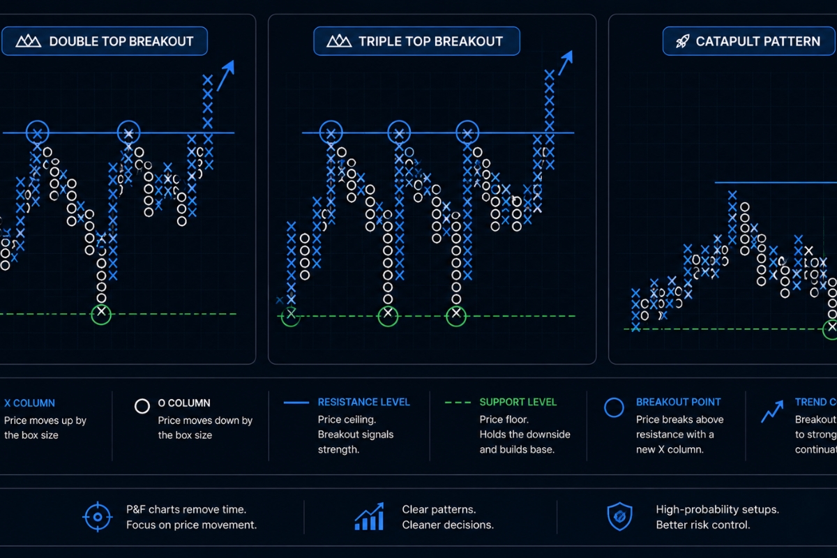
Because P&F charts eliminate random noise, these patterns are exceptionally clean, simple, and completely objective compared to their bar-chart equivalents like head-and-shoulders or double tops. Statistically, a standard P&F breakout pattern carries a high success rate because it requires the market to physically breach a historical horizontal resistance or support layer by a full box unit.
What are the most common P&F patterns?
The most widely utilized patterns within the P&F methodology include:
- Double Top/Bottom Breakout: The most basic formation, requiring a column of Xs to surpass the peak of the previous column of Xs by exactly one box ( Double Top ) or a column of Os to fall one box below a previous trough (Double Bottom).
- Triple Top/Bottom: A powerful continuation pattern where price tests a horizontal barrier twice before completely shattering it on the third attempt.
- The Catapult: An advanced formation where a standard triple top breakout experiences a minor pullback, followed by a secondary breakout that confirms massive institutional momentum.
Recognizing these geometric setups is the first step; the next is applying the proper interpretation rules to find your entries.
How to read patterns in point and figure charts?
Reading these patterns requires looking across the horizontal columns to find structural blocks of supply and demand. To validate a bullish breakout, locate the horizontal resistance line formed by previous peaks; the exact moment a new column of Xs prints a box directly above that line, an official buy signal is triggered. To read a bearish breakdown, observe the horizontal support line formed by previous Os; when a new column of Os prints a box below that floor, it confirms that supply has overwhelmed demand, signaling an immediate exit or short entry.
Once you can comfortably read these patterns, you can integrate them into an actionable, rule-based trading system.
Trading methods using point and figure charting
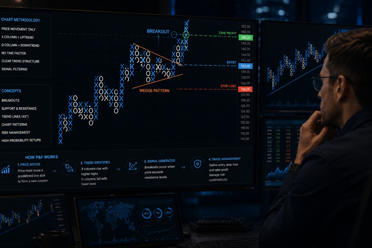
Trading methods using point and figure charting provide a highly disciplined framework that removes human guesswork by dictating exact entry triggers, precise stop-loss locations, and mathematical price targets.
Unlike traditional technical analysis which relies on subjective projection models, P&F methodologies use the horizontal width of a pattern or its vertical height to calculate exact, data-driven profit targets. This mechanical execution approach ensures that your risk-reward parameters are completely locked in before your capital enters the market.
What is a basic trading method with P&F charts?
A highly effective, institutional-grade P&F trading method follows a strict 5-step execution sequence:
- Step 1: Identify wedge structure: Scan your asset class to find a clear P&F consolidation structure (such as a Triple Top pattern) that is developing safely above a 45-degree bullish support line.
- Step 2: Wait for breakout confirmation: Monitor the asset and wait until a column of Xs prints exactly one box above the highest resistance box of the pattern, confirming a valid breakout.
- Step 3: Enter trade in breakout direction: Execute a long position immediately upon the printing of the breakout box, avoiding the need to wait for a time-based candle to close.
- Step 4: Set stop loss outside wedge: Position your defensive Stop Loss safely inside the chart, exactly one box below the lowest point of the immediate preceding column of Os.
- Step 5: Set take profit based on pattern size: Calculate your target using the Horizontal Count Method: measure the number of columns across the pattern’s base, multiply that number by your box size and your reversal factor, and add that sum to the pattern’s low point to find your precise Take Profit target.
While this execution process is highly objective, its real-world performance depends heavily on the liquidity of the underlying market.
Which markets are suitable for P&F trading methods?
P&F trading methods are exceptionally well-suited for liquid, trend-driven environments like major Forex pairs, Blue-chip Stocks, and Commodities. Because these markets attract heavy institutional volume, their price extensions are driven by long-term macroeconomic cycles rather than random retail speculation. Traders looking to apply these precise box-reversal models can seamlessly implement them on the advanced trading feeds and multi-asset terminals championed on the MBroker, ensuring optimal fill execution and clean, uncorrupted data feeds.
To complete your mastery of this technical field, you must contrast these robust trading methods against the pattern’s inherent structural limitations.
Limitations and practical use of point and figure charts
Limitations and practical use of point and figure charts revolve around the fact that this charting style completely sacrifices intraday time data to achieve its signature trend clarity.
Because time is omitted from the calculation, a single P&F column can represent weeks of quiet price compression, making it poorly suited for hyper-fast scalping strategies or high-frequency automated systems. Understanding these structural boundaries ensures that you use this powerful analytical tool only in the specific market environments where it maintains a documented mathematical edge.
What are the limitations of point and figure charting?
The core limitations of relying exclusively on Point and Figure charts include:
- Loss of Intra-Bar Data: Because it only records price extremes that hit full box sizes, a P&F chart completely hides the internal sequence of how those price levels were reached.
- Incompatibility with Volume Indicators: Standard volume-weighted indicators like VWAP or On-Balance Volume cannot be mapped effectively because time-stamped volume data is discarded.
- Delayed Reversal Signals: In fast-moving, news-driven markets, waiting for a full 3-box reversal can cause you to give back a substantial portion of your unrealized profits before an exit signal prints.
Acknowledging these limitations allows you to optimize your workflow by deploying the tool only when conditions are ideal.
When should traders use point and figure charts?
Traders should use Point and Figure charts when they need to define major long-term support and resistance targets or when they find themselves suffering from emotional overtrading due to lower-timeframe candlestick noise. It is an extraordinary tool for macro portfolio management, swing trading, and identifying multi-month institutional accumulation bases. By checking the institutional research resources and technical frameworks updated on the MBroker homepage, you can easily pair P&F trend clarity with your standard price action setups to create an elite, double-confirmed trading system.
In conclusion, Point and Figure Charting remains one of the most powerful, objective, and time-tested methodologies in technical analysis due to its unique ability to isolate pure price trends. By mastering its 45-degree trendline rules, waiting for clean box breakouts, and utilizing mathematical counting targets, you can build a systematic trading edge that stands the test of time.

Thoren Vextal is a specialist in XM trading guides, offering practical insights and real-market experience to help traders improve their strategies and trading performance. Email: [email protected]