
 Tiếng Việt
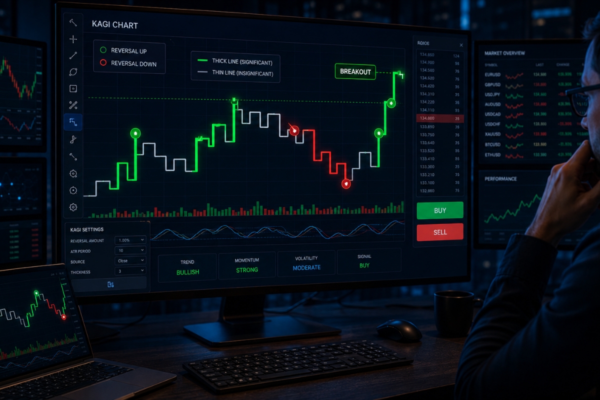
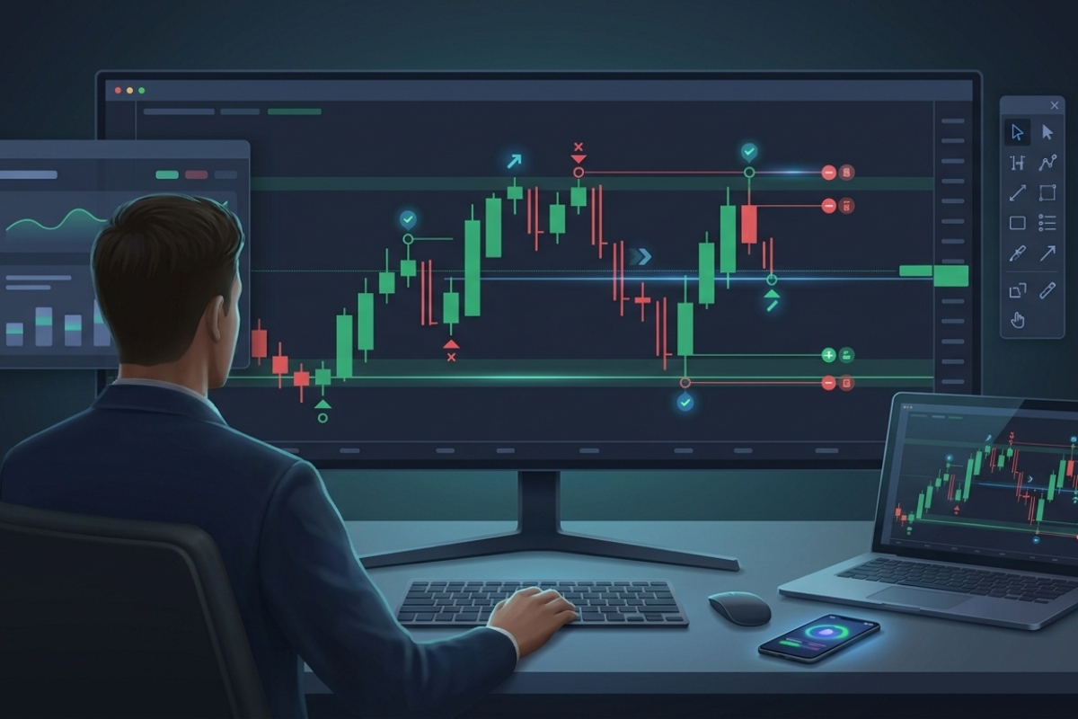
Kagi Chart is a price-action chart that ignores time and highlights trend changes based on reversal levels, helping traders identify market direction more clearly than traditional charts.
Moreover, Kagi Chart structure is built using vertical lines and reversal thresholds, where line thickness (Yin/Yang) changes to reflect shifts in supply and demand.
Additionally, Kagi Chart generates signals through line reversals and thickness changes, with bullish signals appearing when lines turn thick and bearish signals when they turn thin.
Furthermore, traders use Kagi charts by entering trades at breakout and reversal points, applying Buy/Sell strategies based on confirmed trend shifts instead of time-based signals.
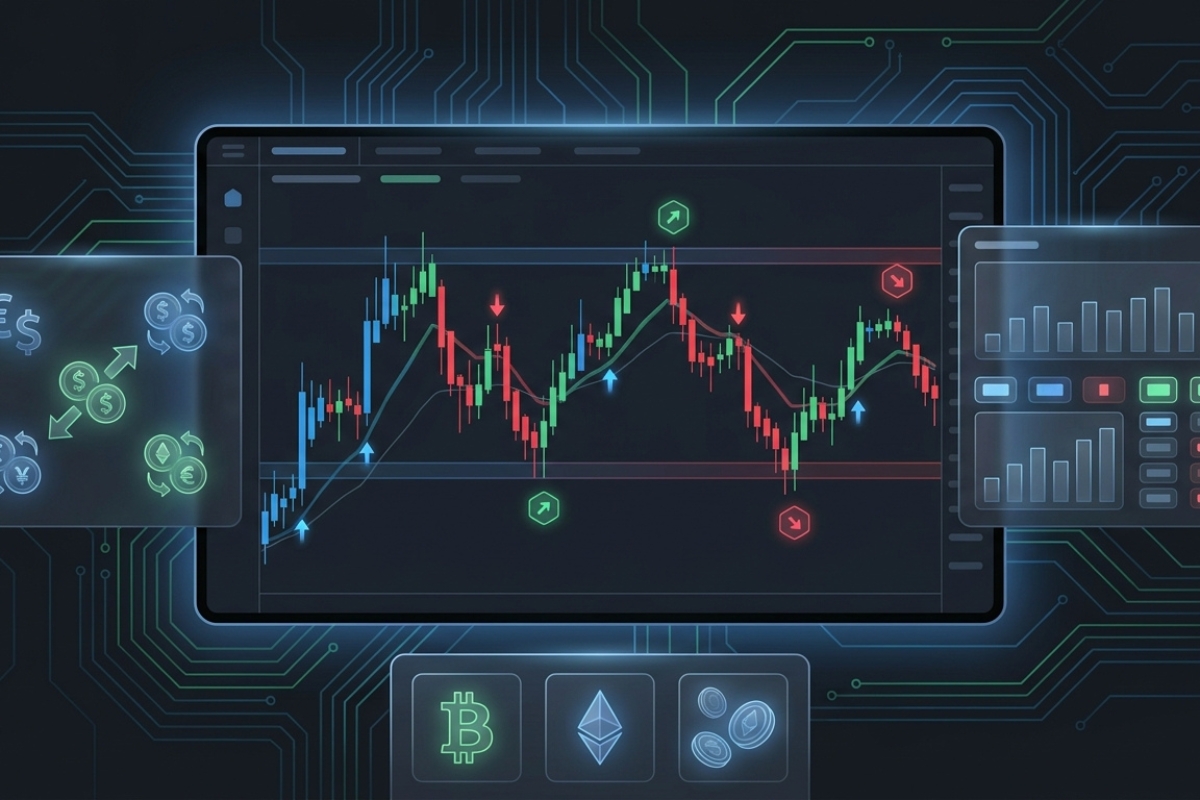
Finally, Kagi Chart can be applied across forex, stocks, and crypto markets, making it a flexible tool for different trading styles and asset classes.
In technical analysis, not all charts are time-based. The Kagi Chart is a tool that removes market noise and focuses entirely on price movement, helping traders identify trends more clearly.
Understand Kagi charts and their role in modern trading
A Kagi Chart is a price-focused technical analysis chart that helps traders filter out market noise and concentrate on meaningful price reversals.
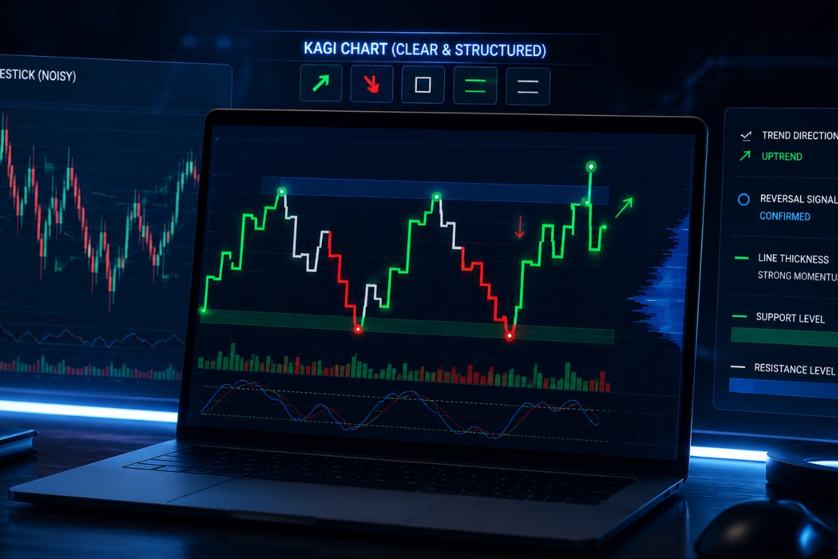
Unlike traditional candlestick charts, Kagi charts do not depend on time intervals. Instead, they change direction only when price moves by a predefined reversal amount. This makes them useful for identifying trend direction, momentum shifts, support and resistance, and potential trading signals in financial markets.
What is a Kagi chart in technical analysis?
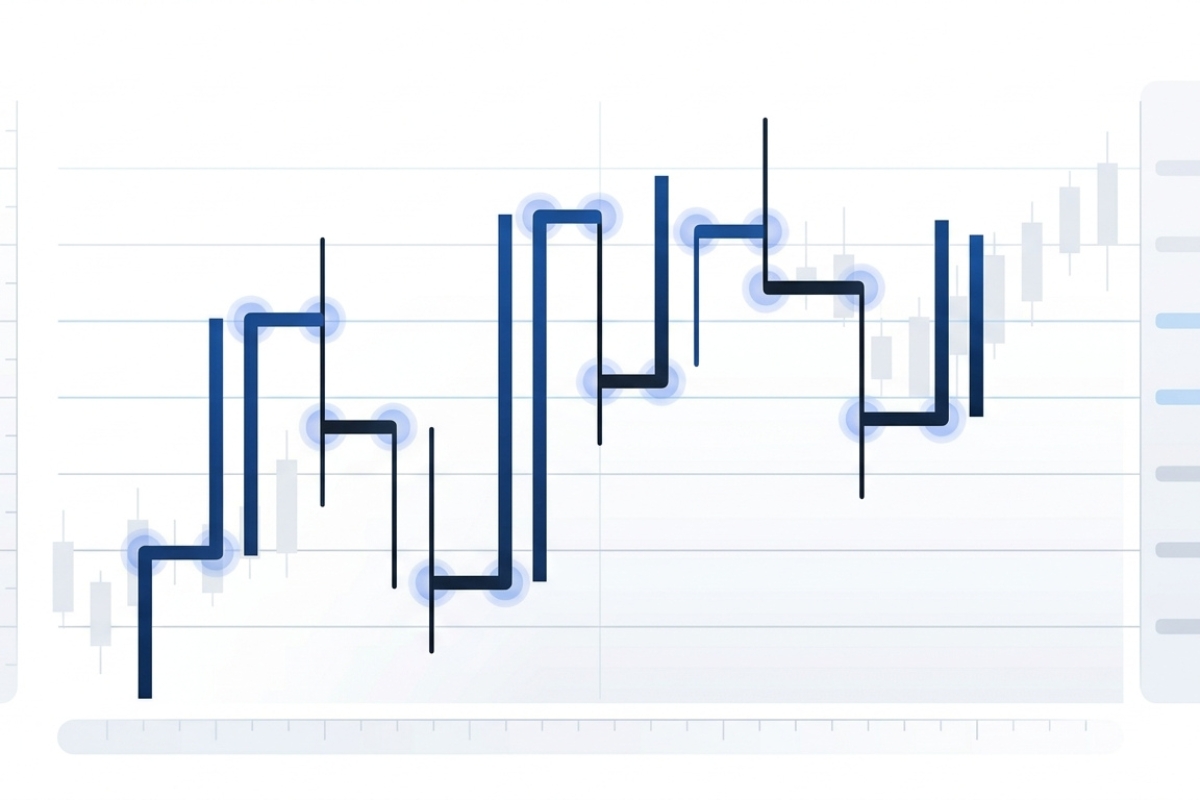
A Kagi Chart is a type of chart used in technical analysis to display price movement based on reversal thresholds rather than time. It was originally developed in Japan and became popular among traders who wanted a cleaner way to understand supply and demand.
A Kagi Chart is made of vertical lines connected by short horizontal lines. When price continues in the same direction, the vertical line extends. When price reverses by a specific amount, the chart draws a horizontal line and then continues vertically in the opposite direction.
For example, if a trader sets a reversal value of 1%, the Kagi Chart will not change direction until the asset price reverses by at least 1%. This helps remove small market fluctuations that often appear on candlestick charts.
The Kagi Chart is especially useful for:
- Identifying major trend changes.
- Reducing emotional reactions to minor price movements.
- Spotting support and resistance zones.
- Confirming momentum through line thickness changes.
- Building systematic trading strategies.
Because it focuses only on price action, a Kagi Chart can provide a clearer view of market structure. However, to understand why traders still use it today, we need to look at its practical value in modern trading.
Why do traders use Kagi charts today?
Traders use Kagi charts today because financial markets often contain a lot of short-term noise. On a normal candlestick chart, every minute, hour, or day creates a new candle, even when the price movement is not important. A Kagi Chart removes this time-based pressure and shows only meaningful price reversals.
This makes Kagi charts valuable for both beginner and experienced traders. A beginner can use them to see trends more clearly, while an advanced trader can combine them with indicators, volume analysis, or multi-timeframe confirmation.
Key reasons traders use Kagi charts include:
- Noise reduction: Minor price changes are ignored unless they meet the reversal condition.
- Trend clarity: The chart shows when price continues or reverses.
- Better discipline: Traders are less likely to react to random fluctuations.
- Signal confirmation: Thickness changes can help confirm bullish or bearish pressure.
- Flexible market use: Kagi charts can be applied to forex, stocks, indices, commodities, and crypto.
For example, in a volatile forex pair, a normal chart may show multiple false signals during a news event. A Kagi Chart may filter out some of those movements if they do not reach the reversal threshold. This allows traders to focus on structure instead of noise. To use this chart effectively, the next step is to understand how it is built.
Structure of Kagi chart and price movement logic
The structure of a Kagi Chart is based on price direction, reversal size, and line thickness. Unlike candlestick charts, which display open, high, low, and close within a time period, Kagi charts only care about whether price continues in the same direction or reverses enough to change course. This structure helps traders read the balance between buyers and sellers more clearly.
How is a Kagi chart constructed?
A Kagi Chart is constructed by drawing a vertical line as long as price continues moving in the same direction. When price reverses by a predefined amount, the chart draws a short horizontal line and then begins a new vertical line in the opposite direction.
The reversal amount can be set in several ways:
- Fixed price value: For example, $5 on stock.
- Percentage value: For example, 2% of price movement.
- ATR-based value: Based on Average True Range to reflect market volatility.
- Pip or point value: Commonly used in forex or index trading.
Suppose a stock is trading at $100, and the trader sets a reversal amount of $3. If price rises to $110, the Kagi line moves upward. It will not reverse downward unless price falls by at least $3 from the recent high. If price drops from $110 to $107, the chart changes direction.
This construction method gives the Kagi Chart a unique advantage: it filters out small movements and highlights stronger price changes. However, the most important feature of Kagi charts is not only direction. It is also the change between thin and thick lines, often called Yin and Yang.
What do thickness changes (Yin and Yang) represent?
In a Kagi Chart, thickness changes represent shifts in market strength. Traditionally, a thin line is called Yin, and a thick line is called Yang. These changes occur when price breaks above a previous high or below a previous low.
A Yang line usually indicates bullish strength. It appears when price breaks above a previous swing high, showing that buyers are gaining control. A Yin line usually indicates bearish weakness. It appears when price breaks below a previous swing low, showing that sellers are gaining control.
For example, if a Kagi Chart changes from thin to thick after breaking above a previous resistance level, traders may interpret this as a bullish confirmation. If the chart changes from thick to thin after falling below support, it may suggest bearish momentum.
This Yin and Yang logic is one of the most important reasons traders use Kagi charts for signal generation. After understanding the structure, traders can begin identifying actionable trading signals.
Trading signals generated by Kagi chart
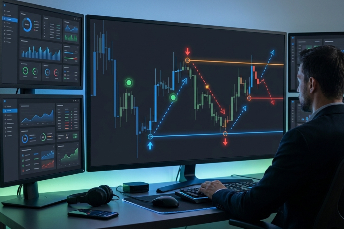
A Kagi Chart generates trading signals mainly through direction changes, line thickness changes, breakouts, and support or resistance reactions. Since the chart ignores time and focuses on price movement, the signals are often cleaner than those on standard charts. However, traders should still confirm signals with risk management and market context.
What are the main trading signals in Kagi charts?
The main trading signals in Kagi charts include trend reversals, Yin-Yang changes, breakout signals, and continuation patterns. Each signal provides a different view of price action and market momentum.
Common Kagi Chart signals include:
- Buy signal from thin-to-thick change: When the line changes from thin to thick, it means price has broken above a previous high. This is often interpreted as a bullish signal.
- Sell signal from thick-to-thin change: When the line changes from thick to thin, it means price has broken below a previous low. This is often seen as a bearish signal.
- Trend continuation signal: If the Kagi line continues in one direction without reversing, it suggests strong trend momentum.
- Support breakout signal: When price breaks below a previous support zone and the line turns thin, sellers may gain control.
- Resistance breakout signal: When price breaks above resistance and the line turns thick, buyers may gain control.
For example, if EUR/USD forms a thin-to-thick Kagi signal after breaking above a major resistance level, traders may consider a long position. If the same pair later turns thick-to-thin after breaking support, it may be a signal to exit or consider a short trade.
Still, no signal is perfect. Traders must evaluate whether Kagi Chart signals are reliable enough for live trading.
How reliable are Kagi chart signals in trading?
Kagi Chart signals can be reliable in trending markets, but they may become less effective in sideways or choppy conditions. Because Kagi charts depend on reversal size, their reliability is strongly affected by the chosen settings and the volatility of the asset.
A Kagi Chart can help reduce false signals, but it does not eliminate them completely. If the reversal amount is too small, the chart may change direction too often. If the reversal amount is too large, signals may appear late.
Factors that affect signal reliability include:
- Market trend strength: Kagi charts work better in trending markets.
- Reversal setting: The chosen price, percentage, or ATR value must match market volatility.
- Liquidity: Higher liquidity usually creates more reliable price action.
- Trading cost: Spreads and commissions can reduce profitability.
- Confirmation tools: Indicators or support and resistance can improve signal quality.
Many professional traders do not use Kagi charts alone. They combine them with moving averages, RSI, MACD, or volume analysis. For example, a trader may only buy when the Kagi line turns thick and the price is above a 50-period moving average.
As a financial trading tool, the Kagi Chart is powerful when used with a complete trading plan. The next step is learning how to trade it on a platform.
How to trade on the platform using Kagi charts
Trading with a Kagi Chart on a platform requires correct chart setup, clear signal rules, position sizing, and risk management. A trader should not open positions simply because the line changes thickness. Instead, each trade should follow a structured process that includes market analysis, confirmation, entry, stop-loss, and exit planning.
How to trade Kagi charts step by step?
To trade Kagi charts step by step, traders should begin by selecting the market, setting the reversal value, identifying signals, and managing risk before entering a trade.
A simple Kagi Chart trading process includes:
- Choose the market: Select a liquid asset such as EUR/USD, gold, Bitcoin, Apple stock, or a major index.
- Set the reversal amount: Use a fixed value, percentage, or ATR-based setting. For example, a stock trader may use a 2% reversal, while a forex trader may use a 20-pip reversal.
- Identify the main direction: Look at whether the Kagi line is mainly moving upward or downward.
- Watch for thickness changes: A thin-to-thick change can suggest buying pressure. A thick-to-thin change can suggest selling pressure.
- Confirm with support and resistance: Avoid entering trades in the middle of unclear price zones.
- Place the trade: Enter after the signal is confirmed, not before.
- Set stop-loss and take-profit: Place the stop-loss near the most recent swing level. Take profit at a key resistance, support, or after an opposite Kagi signal.
- Control risk: Many traders risk only 1% to 2% of account equity per trade.
For example, if a Kagi Chart on GBP/USD turns from thin to thick after breaking resistance, a trader may enter a buy trade. The stop-loss can be placed below the recent Kagi swing low, while the take-profit can be set near the next resistance level.
Platforms and educational trading websites such as MBroker can be useful for traders who want to learn how chart types, trading tools, and financial strategies work together. However, traders should always test Kagi strategies on a demo account before using real capital. After learning the trading process, it is important to know which platforms support Kagi charts.
Which platforms support Kagi chart trading?
Several trading and charting platforms support Kagi Chart trading, either directly or through custom indicators and scripts. Availability depends on the broker, platform version, and installed charting tools.
Popular platforms that may support Kagi charts include:
- TradingView: Offers built-in Kagi chart options for many assets.
- MetaTrader 4 (MT4): Usually requires a custom indicator or expert advisor.
- MetaTrader 5 (MT5): May require custom tools, though some brokers provide advanced charting add-ons.
- NinjaTrader: Supports advanced chart types and custom strategies.
- ProRealTime: Often used by technical traders for alternative charting.
- StockCharts: Provides Kagi charts for stock market analysis.
- Broker platforms: Some brokers include Kagi charts in their proprietary trading platforms.
TradingView is one of the easiest platforms for beginners because users can select Kagi directly from the chart type menu. On MT4 and MT5, traders often need to install third-party Kagi indicators. Before using any custom tool, traders should verify its accuracy, source, and compatibility.
Once traders understand how to access Kagi charts on a platform, they can apply them to real markets such as forex, stocks, and crypto.
Applying Kagi chart in different financial markets
A Kagi Chart can be applied across different financial markets because it is based on price movement rather than time. It can help traders analyze forex pairs, stocks, indices, commodities, and cryptocurrencies. However, each market has different volatility, liquidity, spreads, and trading hours, so the Kagi settings must be adjusted carefully.
How to use Kagi charts in forex and stock trading?
Kagi charts can be used in forex and stock trading to identify trends, reversals, breakouts, and major support or resistance levels. In forex, traders often use Kagi charts to filter intraday volatility. In stocks, investors may use them to analyze medium-term or long-term trends.
In forex trading, Kagi charts are useful because currency pairs often move in trends during active sessions. Major pairs such as EUR/USD, USD/JPY, and GBP/USD usually have tight spreads and high liquidity, making them suitable for Kagi analysis.
Forex traders can use Kagi charts to:
- Confirm trend direction.
- Avoid minor price noise.
- Trade breakouts from support and resistance.
- Identify reversal signals after strong moves.
- Combine price action with moving averages or RSI.
In stock trading, Kagi charts can help investors detect when buying or selling pressure changes. A stock that turns from thin to thick after breaking a previous high may suggest renewed bullish interest. A stock that turns from thick to thin after breaking support may indicate weakness.
For example, if a technology stock rises above a previous high and the Kagi line turns thick, swing traders may see this as a bullish continuation signal. If the line later turns thin after breaking a recent low, it may become an exit signal.
Although Kagi charts can work well in forex and stocks, crypto markets require special attention because of higher volatility.
Are Kagi charts suitable for crypto trading?
Yes, Kagi charts can be suitable for crypto trading, but traders must use wider or volatility-adjusted reversal settings. Cryptocurrency markets are highly volatile and operate 24/7, which means price can move sharply at any time. A Kagi Chart can help filter unnecessary noise, but poor settings may create too many false signals.
For crypto assets such as Bitcoin, Ethereum, or Solana, traders may consider:
- Using percentage-based reversal values.
- Applying ATR-based settings.
- Avoiding very small reversal thresholds.
- Confirming signals with volume.
- Watching major support and resistance zones.
- Using wider stop-loss levels due to volatility.
For example, a 0.5% reversal setting on Bitcoin may generate many signals during volatile periods. A 2% or 3% setting may provide cleaner trend direction for swing trading. The best setting depends on trading style, market conditions, and risk tolerance. Read more detailed information about Kagi Charts in the XM Guide to learn about the many popular chart types currently available on the market.
In conclusion, the Kagi Chart is a valuable technical analysis tool for traders who want to focus on price action, trend strength, and meaningful reversals. Its structure, Yin-Yang thickness changes, and platform flexibility make it useful across forex, stocks, and crypto.

Thoren Vextal is a specialist in XM trading guides, offering practical insights and real-market experience to help traders improve their strategies and trading performance. Email: [email protected]