
 Tiếng Việt
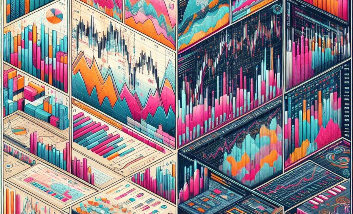
Bar charts and candlestick charts are two of the most commonly used tools in technical analysis, each offering unique visual insights into price action. While both display the same core data open, high, low, and close, their visual formats can affect how traders interpret market behavior. Understanding the strengths and differences between these two chart types can help you choose the right one for your trading strategy on XM.
Choosing between bar and candlestick charts often comes down to clarity and personal preference. Let’s compare how each chart type works and which one may better suit your trading goals as you continue to learn trading and refine your strategy.
What Is a Bar Chart in Technical Analysis?

A bar chart is one of the foundational chart types in technical analysis, providing traders with clear and concise information about price movements over time. Unlike line charts, which show only closing prices, or candlestick charts, which are visually stylized, bar charts prioritize precision in presenting price data.
How is a bar chart structured (open, high, low, close)?
Each bar on a bar chart contains four key price points:
-
Open: A short horizontal tick on the left side of the bar
-
Close: A short horizontal tick on the right side
-
High: The top of the vertical line
-
Low: The bottom of the vertical line
This OHLC structure allows traders to see:
-
Whether the price closed higher or lower than it opened
-
The range (volatility) of price within the selected timeframe
For example: If the right tick (close) is above the left tick (open), the bar is bullish; if it’s lower, the bar is bearish.
What does each bar represent in different timeframes?
Bar charts are highly flexible each bar adapts to the selected chart timeframe:
-
1-minute chart: Each bar shows OHLC for 1 minute of trading
-
Hourly chart: Each bar shows OHLC for one hour
-
Daily chart: Each bar shows one day’s OHLC data
This makes bar charts suitable for:
-
Scalpers and intraday traders (1M–15M bars)
-
Swing traders (H1–D1 bars)
-
Investors (weekly/monthly bars)
Traders can analyze bar formations such as:
-
Inside bars: Potential consolidation
-
Outside bars: Potential reversal or volatility expansion
-
Pin bars: Rejection at key levels
Are bar charts better for minimalist or data heavy traders?
Bar charts strike a balance between minimalism and depth. They’re especially favored by:
Minimalist traders, because:
-
Bars are visually clean and free from color distractions
-
They allow the trader to focus strictly on price behavior, not chart aesthetics
Data heavy traders, because:
-
Each bar still provides 4 vital data points (OHLC)
-
More bars can fit into a single screen view, ideal for pattern recognition
Many professional traders, especially in legacy markets like futures or commodities, still prefer bar charts for their objectivity and clarity, a style also supported by platforms such as XM.
What Is a Candlestick Chart and How Does It Work?

Candlestick charts are one of the most widely used tools in technical analysis, favored by their ability to visualize market sentiment, price action, and potential turning points all in a single glance. They offer more depth than traditional line or bar charts by illustrating the dynamics between buyers and sellers over a given time period.
What are the key elements of a candlestick (body, wick, open/close)?
A single candlestick represents price movement for a specific timeframe and consists of four crucial data points:
-
Open: The price at which the asset began trading during the selected period.
-
Close: The final price at the end of that period.
-
Body: The area between the open and close. A filled or colored body typically indicates a bearish session (price closed lower), while a hollow or differently colored body shows a bullish session (price closed higher).
-
Wick (or Shadow): The thin lines above and below the body showing the highest and lowest prices reached during that time.
For example: A long upper wick suggests sellers pushed the price down after buyers initially drove it up potentially signaling weakness.
What types of candlestick patterns exist?
Candlestick patterns are classified into single, double, or multi candle formations and can signal reversals or continuations. Common examples include:
-
Doji: Open and close are nearly equal signals indecision or a potential reversal.
-
Engulfing (Bullish or Bearish): A larger candle fully engulfs the previous one, often a reversal signal.
-
Hammer & Hanging Man: Small body with a long lower wick bullish (hammer) or bearish (hanging man) depending on context.
-
Morning Star / Evening Star: Three-candle patterns indicating trend reversals.
-
Three White Soldiers / Three Black Crows: Strong continuation patterns after a reversal.
These patterns help traders assess momentum, exhaustion, or strength in a trend.
What is the historical origin of candlestick charts ?
Candlestick charts were developed in 18th century Japan, long before Western technical analysis was formalized. The method is credited to Munehisa Homma, a rice trader from Sakata, who used candlestick principles to analyze supply and demand psychology.
-
He identified emotional patterns in price behavior concepts like fear and greed which remain relevant today.
-
His early charting technique evolved into what we now call Japanese candlestick charting, later introduced to the Western world by analyst Steve Nison in the 1990s.
Legacy meets innovation: The combination of visual clarity and psychological insight is why candlestick charts are still dominant today.
Which Chart Type Offers Better Visualization?

Choosing the right chart type can significantly impact how effectively traders analyze market movements. Among the most popular choices are candlestick charts and bar charts each with unique strengths depending on a trader’s strategy, preference, and level of experience.
Which is easier to read for spotting trends or momentum shifts?
Candlestick charts are generally easier for most traders, especially beginners and visual learners to interpret. The color-coded bodies and prominent wicks quickly highlight:
-
Bullish vs. bearish candles
-
Reversal signs such as doji, hammers, or engulfing patterns
-
Momentum shifts via size and frequency of candle bodies
In contrast, bar charts represent the same data (open, high, low, close) but with a more technical appearance. They lack the visual contrast of filled/unfilled bodies, making momentum shifts slightly harder to spot at a glance.
Can traders interpret price psychology better with candlesticks?
Yes, candlestick charts offer clearer visual cues of market psychology, particularly regarding trader sentiment and emotional extremes. Risk Warning XM, all trading involves risk and patterns may not always predict future outcomes.
For example:
-
A long wick on a candlestick may signal strong rejection of a price level, which might be missed or less obvious on a bar chart.
-
Patterns, like spinning tops, hammers, or morning stars, visually reflect indecision, reversals, or exhaustion insights rooted in trader behavior.
These elements help traders “read the story” behind each session and make informed decisions.
Are bar charts more suitable for algorithmic or professional traders?
Bar charts tend to be preferred by institutional and algorithmic traders, who prioritize data density over visual clarity. The cleaner structure of bar charts:
-
Reduces screen clutter
-
Makes it easier to overlay technical studies
-
Provides consistent formatting for algorithmic parsing
While they are less intuitive for human interpretation, bar charts offer speed and simplicity for professional setups and automated strategies. Professional quants often use bar charts for backtesting and coding due to their minimalistic format.
Do Chart Types Impact Trading Outcomes?

The type of chart you use can influence how effectively you analyze price action and execute trades. Understanding whether bar charts or candlestick charts affect your trading accuracy and strategy compatibility is crucial.
Can the choice of chart type affect entry/exit accuracy?
Yes, the chart type can impact the precision of your trade entries and exits. Candlestick charts, with their distinct color coding and pattern shapes, often help traders identify reversal and continuation points more clearly, improving timing. Bar charts provide similar data but lack immediate visual cues, which may cause slight delays in decision-making for less experienced traders.
Are candlestick patterns more actionable than bar patterns?
Generally, yes. Candlestick patterns like engulfing, doji, and hammer are widely recognized and provide actionable signals because their formations reflect the psychological battle between buyers and sellers. Bar chart patterns tend to be subtler and may require more analytical effort to interpret, making candlesticks more user-friendly, especially for discretionary traders.
Do certain strategies work better with one chart type over the other?
Indeed. Some trading strategies align better with specific chart types:
-
Trend following and breakout strategies often benefit from candlestick charts due to clearer visual pattern recognition.
-
High frequency and algorithmic trading commonly favor bar charts for their simplicity and cleaner data presentation.
-
Discretionary traders usually prefer candlestick charts for intuitive price action reading, while quantitative approaches might rely on bar charts or even line charts.
Choosing the right chart type based on your strategy can enhance your overall trading performance.
When Should You Use Bar Charts vs. Candlestick Charts?

Different trading styles require different tools and your choice between bar charts and candlestick charts can influence how well you identify signals, manage entries, and time exits. Here’s how to know which chart type suits specific strategies and contexts.
Which is better for trend trading or breakout strategies?
For trend trading and breakout setups, both chart types are viable, but candlestick charts tend to offer more intuitive visual cues that help traders:
-
Recognize continuation patterns (e.g., bullish engulfing, three white soldiers)
-
Detect early breakout attempts via long-bodied candles
-
Evaluate reversal threats through wicks and doji formations
Bar charts provide the same information, but without immediate visual contrast. As a result, they may require more analytical experience to interpret quickly.
Best pick: Candlestick charts for most trend and breakout.
Are bar charts more effective in high-frequency or intraday trading?
Yes. Bar charts are favored in high frequency and intraday environments, where:
-
Screen space is limited, and simplicity matters
-
Traders rely on minimalist setups with multiple indicators or overlays
-
Speed and precision outweigh visual appeal
Professional and algo traders often use bar charts in scalping or low latency strategies because their clean lines and neutral format are easy to process in rapid succession.
Best fit: Bar charts for fast-paced, data dense trading setups
Are candlestick charts more intuitive for discretionary trading?
Absolutely. For discretionary or manual traders, candlestick charts provide clearer storytelling through shape, color, and pattern formation.
-
Wicks and bodies reveal real-time battle zones between buyers and sellers
-
Common patterns (e.g., hammer, evening star) are visually distinct and psychologically insightful
-
Easier to react to sentiment shifts with less reliance on indicators
Traders who make decisions based on visual structure or emotional flow of the market typically prefer candlesticks.
Ideal for: Traders relying on visual pattern recognition and price action bias

Lina Vexley is a forex education specialist with a passion for guiding new traders. She offers step-by-step lessons on MetaTrader and risk control, making XM accessible and practical for traders of all experience levels. Email: [email protected]